Without Dreams


Rarely do I recommend books of which I create covers. This one is an exception. It stirred me a lot perhaps because of its inner violence that spilled out too often for my own comfort. A dark tale needed an appropriate cover and what I have done makes me come to terms with my often violent streak. A word of praise for the senior editor Saugata Mukherjee of Harper Collins India who (to my surprise!) chose this dark one over a more sanitised version (which I would try to post later).

Joy


Joy Goswami is a brilliant poet. Period. I cease to get objective whenever I read his poems. So when Sachin Rastogi of Worldview said that he wanted to publish a translation of his poems, I was delighted. I still haven't gone through the translations and this cover is entirely based on my reading of Joy's Bengali originals. The cover is very personal and although I am yet to get a final feedback from Sachin, I thought it should be up here.
Hmm... the top one is the sanitised version... and the published one. I understood the poets themselves don't always understand.

Manna Dey


Can any cover ever capture the texture of his voice? Nevermind you can just keep trying...

Dateline Islamabad


I truly enjoyed doing this cover. The strength of this cover lies in the meticulous composition of various scattered elements.The subject is interesting and a bit offbeat which makes a case for an out of the box cover.

Invitation Cards for BCL


I personally like designing invitation cards. They pose a challenge of different kind. Sometimes a well designed card makes you keep invitations otherwise you may have skipped. These are two cards I designed for British Council Kolkata. One for a launch of a cricket book and another for Benjamin Zephaniah performance. Both of them are teasing in their own way. The cards are presented sequentially - the front flap, the inside and the back flap.

Explosion of words


Sometimes you need to go for pure ideas. Period.

English Language


I am fascinated by Asterix so this cover is in a way my humble tribute to the drawing skills of Uderzo. There is an undertone of parody - a mock situation which hints at the eclectic development of English language down the ages.

Look Before You Leap


I created this humorous poster rather casually. I think the execution can be a lot better specially the drawing in the background but I am really proud of the idea. Actually it was sent as an entry to a competition organised by Calcutta Police to promote awareness among the jaywalkers who do not abide by the Zebra crossing. The entry earned me a pat at my back from the then chief himself but failed to win a prize which was not surprising at all. There was no text in the poster whose image was enough to get the message through.

Ray


"Speaking of films" is the English translation of Satyajit Ray's "Bishoy Chalachitro" - a melange of articles regarding filmmaking. I read it in the original. Despite its slim appearance it still remains a definitive book for a beginner who wants to dabble on film-making. I just wanted to do a cover with intelligent dispersal of various eyes of the Ray's film protagonists looking at or away from each other.

Amitabh


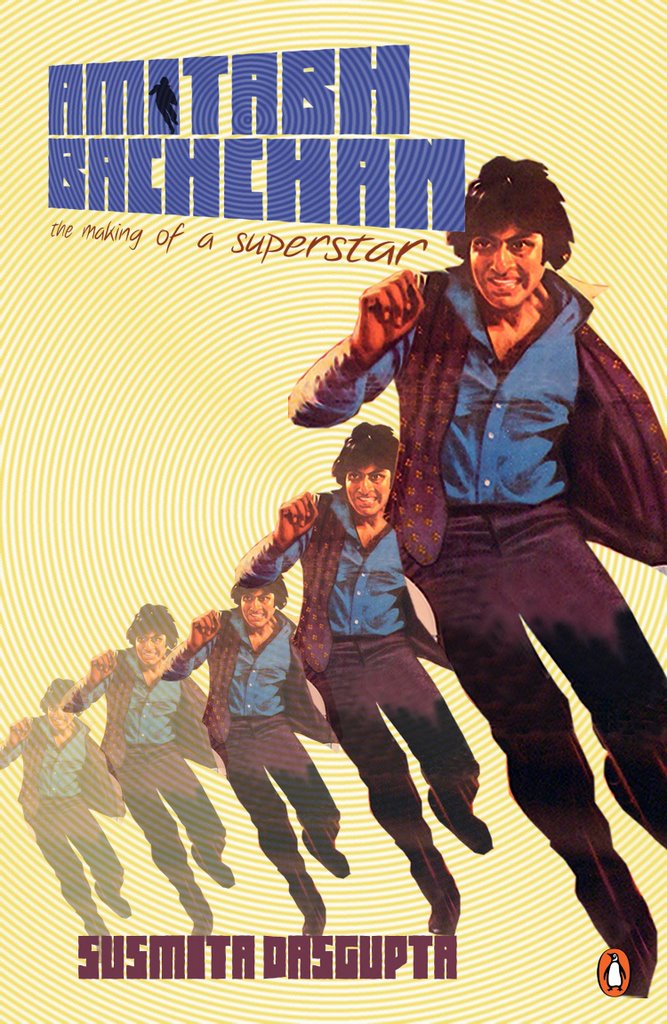
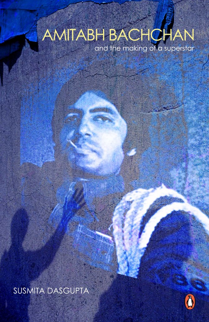
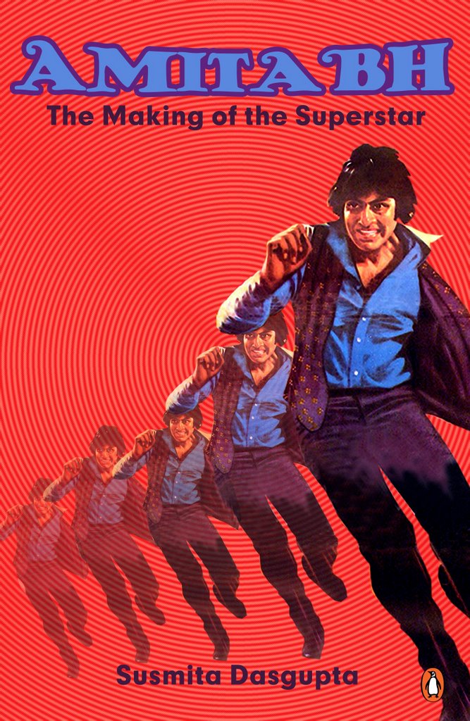
I personally don't like Amitabh a lot. I think he could have influenced Bollywood towards adulthood during the 70s but he didn't. He had an over bearing influence then. He was happy to reside in his own cocoon of "megastardom". As an actor he is above-average, certainly not of the calibre of a Naseer or a Kamal Hassan or a Soumitra. But he never ceases to surprise me. Right now, sometimes he really surprises me with his acting like in "Sarkar", a role tailormade for him. He CAN be very powerful if used well and with insight. However, he is a true icon of this diverse nation - there can be no doubt about that. With these bittersweet ideas i approached the cover. Initially i wanted to capture a visual story of an Amitabh film being screened in the open while an enthusiastic boy wanted to touch the screen ... to "feel" him. Then I settled for a retro look which was intentionally made pulp-y to capture the lost era with its fetishes. The cover finally chosen is the third one in the sequence.

Palimpsest Seminar Posters


I take a lot of pride in these works as everything from the photos to the arranged detailing is shot by me using my own Canon 2s 1s which I think is a great camera to own. Only the third one which is the cover of the folder distributed at this international conference has a photo shot earlier by Ujjal De for an entirely different assignment. Other promotional materials were also designed by me. There are other variations of the poster as well but I selected these two for their inherent contrast. The brief was just that. Great fun.

Film Theory


Still unpublished but in the pipeline... I am not entirely satisfied although the publisher is quite happy with the cover. Out of the box film book covers are always tough to do. The shot of the hand is mine. I tried to give a different background with blue brushstrokes. However, what I envisaged in the beginning I failed to execute - that's a confession.

The Posters 2


Freud and Lacan deconstructed...

Seminar On Freud and Lacan - The Posters Part 1


These are all part of the hugely successful Lacan Symposium held at Jadavpur University when I was a student there. I still think Santanu Biswas (always Santanuda to me and one of my fav teacher) gave me a lot of liberty in conceiving and executing the posters. I took the words "Freud's French Revolution" and played around them. The first one is a blend of real Artaud performing with the painting "Murder of Marat". The second one is a take off from Delacroix's iconic painting incorporating Freud's face in one of the revolutionaries while the third was a beeped blurb spoken by Eiffel Tower itself.
Ofcourse it is a five letter word: F R E U D.

Freud Redone


This is not published but a redone cover. I am fascinated by the "Introducing" series pioneered by Icon Books England. The graphic novel format was a great way to make the readers acquaint themselves with new ideas and concepts. My favourite is The Beginners guide to Holocaust. In the above cover, I wanted to catch the fun element at the conceptual level. The cartooning skills are mine and I thought it came out very well.

Rhetoric of English India


This is an important academic book and the Indian edition is a welcome respite from the costly foreign editions. Being a lecturer in English I felt very happy when I received the brief to do the cover. I settled for a minimalist cover with lot of open spaces to ponder about.

The Guide


The Guide is book that I teach in the undergraduate courses. Most of the books of RK Narayan has very stolid cover although the possibility is immense. I seized on a key metaphor of the journey ( which also double up as "The feet of the Guru") for this minimalist cover.

Waiting for Rain


I attach a lot of emotional value to the cover for a lot of reasons. The picture of the girl is my sister and I think my shot captures her soft inner beauty very well. The picture also fits the theme of the cover. The other picture is from Satyajit Ray's "Pratidwandi" - a film on the angry young generation of 1970 s Bengal, one of my favourites. It was also one of the first cover I did for Penguin India.

My Temporary Son


I was warned that the writer is extremely meticulous about what he wants. There were visions and revisions and further revisions till I got what he wanted. I like the pair of eyes in the cover and had a tough time to blend them creatively with the backgroud texture and lighting arrangement.

Island of Infinity: Marina's Dream


My first Puffin book. Although the book is for grown-up kids I didn't approach the design that way. I just saw it as another cover for a very interesting adventure tale. It is a work that involved a lot of detailing. Done entirely in Adobe Illustrator, the design is perhaps one of the most time-consuming work done by me till now.