Trying to Grow


I literally gave up hope of doing this cover as I was fiddling with stereotyped cover ideas...It is a melange of images taken from the place where I get inspired every moment: the comics. The drawing is not greatly different from available comics but when put on the cover of a book like that of Kanga's, it works remarkably well. There will be more subtle manipulations and they will put up whenever done.

The Silent Raga


Saugata and I are gradually developing into a great team...just like I share a great synergy with Ajanta. He is like a dream editor who gives you a lot of space. I enjoy the constructive process of putting a cover together which is fun, really. This is a very good book and I think it deserves every bit of accolade it is getting worldwide. Sometimes I wonder how unlike me are my covers...the hard-hitting ones are waiting to be born.

Books by Kunal Basu - Redux


This is how the covers stand after redoing it with that extra splash of colour. The golden colour will be embossed to give it a more exclusive look. I have tried to maintain a consistent series look to all the books to give it an identity of its own...

Books by Kunal Basu


Originally I thought of minimalist covers... In fact, Racists cover idea was immensely liked by Saugata. However, Kunal wanted more colour and I changed my mind...

Lacan Seminar 2


It is a pleasure to do posters for Santanuda, my teacher at Jadavpur. His only brief, for the second time on a trot (please refer to the archives for Lacan Seminar 1) - do whatever you like. This magical brief never fails to produce the desired effect. I always feel free while designing posters for Jadavpur University - the place which nurtured my creativity and made me feel at ease. In both the posters I like James Joyce's pose, a man with whom I can connect the most.

The Japanese Wife


This book of exceptional short stories by Kunal Basu is about to be released in January from Harper Collins India. I have tried to convey the sublime romance in the title story though small details of Japanese miniatures amidst warm shades. The pictures are from the forthcoming film The Japanese Wife directed by Aparna Sen which is sure to make the book quite popular. Earlier I tried the vertical Japanese style lettering but that seemed to overwhelm the whole cover. As always, sheer simplicity speaks more...

Black Chin White Chin


The cover of this forthcoming book is a real toughie... so for a change just concentrated on the tone of the book specially the colour texture which if used innovatively can capture the atmosphere of a narrative like nothing else... In final analysis, I think saugata also made the correct decision of concentrating on a single image balanced by the large typo at the bottom. The end result, I think, is quite nice...

The Observant Owl


I simply love the subversive quality of the original book which remains a perennial favourite. It is an extremely tough (almost impossible) book to translate and I am personally amazed by the audacity of the person who even attempted to have a go. It is a fitting tribute to Hootum that Swarupda, who possesses an edgy humour behind his seemingly "proper" demeanour, has done the honours. I also have a secret desire to see Hootum on screen and expect an equally spunky person to create that classic. The cover just plays around with open white space which in a way is thematically antithetical to the plethora of characters that crowd the book. In a way, this book introduces the imprint Black Kite which in future may be a landmark for Permanent Black - one of the few publishers in India who can marry academia with popular appeal without compromising too much... Whatever, their logo remains one of the best I have even seen and it is a privilege to see my name by the side of such a killer logo.

Worldview Critical Companion - 1


For a long time during the beginning of my designing career, I worked a lot on Worldview critical companions. It gave me a chance to redo a lot of classics... However, now I would have done them differently...

From Raj to Swaraj


My original idea was more flamboyant but the author settled for this tight busy look. By the way, the book is quite a fascinating read and (Oh yes!) documentative.

The poster that never made it...


This poster which imitated the old machine draft on rough paper never made it to print. I felt for Debanjan da who really did so much to give it a life of its own but sometimes everything is not in our hands...Can you notice the barcode here doubling up as book spines ?? I think this could have been better represented.

Without Dreams


Rarely do I recommend books of which I create covers. This one is an exception. It stirred me a lot perhaps because of its inner violence that spilled out too often for my own comfort. A dark tale needed an appropriate cover and what I have done makes me come to terms with my often violent streak. A word of praise for the senior editor Saugata Mukherjee of Harper Collins India who (to my surprise!) chose this dark one over a more sanitised version (which I would try to post later).

Joy


Joy Goswami is a brilliant poet. Period. I cease to get objective whenever I read his poems. So when Sachin Rastogi of Worldview said that he wanted to publish a translation of his poems, I was delighted. I still haven't gone through the translations and this cover is entirely based on my reading of Joy's Bengali originals. The cover is very personal and although I am yet to get a final feedback from Sachin, I thought it should be up here.
Hmm... the top one is the sanitised version... and the published one. I understood the poets themselves don't always understand.

Manna Dey


Can any cover ever capture the texture of his voice? Nevermind you can just keep trying...

Dateline Islamabad


I truly enjoyed doing this cover. The strength of this cover lies in the meticulous composition of various scattered elements.The subject is interesting and a bit offbeat which makes a case for an out of the box cover.

Invitation Cards for BCL


I personally like designing invitation cards. They pose a challenge of different kind. Sometimes a well designed card makes you keep invitations otherwise you may have skipped. These are two cards I designed for British Council Kolkata. One for a launch of a cricket book and another for Benjamin Zephaniah performance. Both of them are teasing in their own way. The cards are presented sequentially - the front flap, the inside and the back flap.

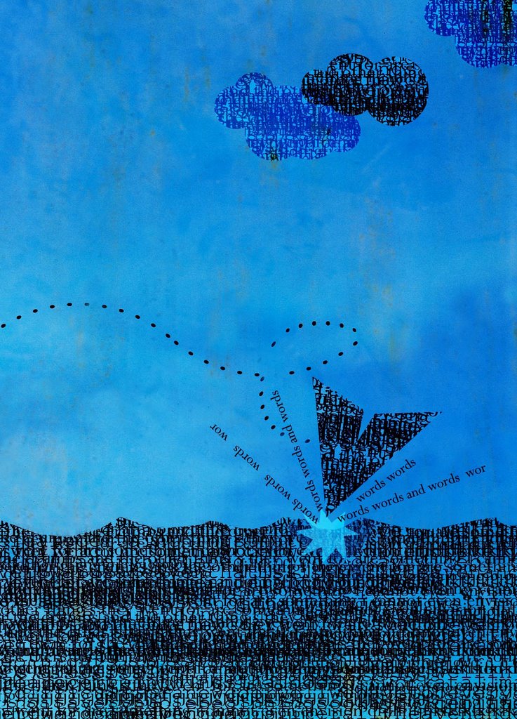
Explosion of words


Sometimes you need to go for pure ideas. Period.

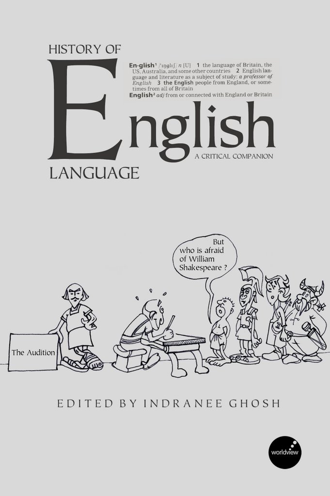
English Language


I am fascinated by Asterix so this cover is in a way my humble tribute to the drawing skills of Uderzo. There is an undertone of parody - a mock situation which hints at the eclectic development of English language down the ages.

Look Before You Leap


I created this humorous poster rather casually. I think the execution can be a lot better specially the drawing in the background but I am really proud of the idea. Actually it was sent as an entry to a competition organised by Calcutta Police to promote awareness among the jaywalkers who do not abide by the Zebra crossing. The entry earned me a pat at my back from the then chief himself but failed to win a prize which was not surprising at all. There was no text in the poster whose image was enough to get the message through.

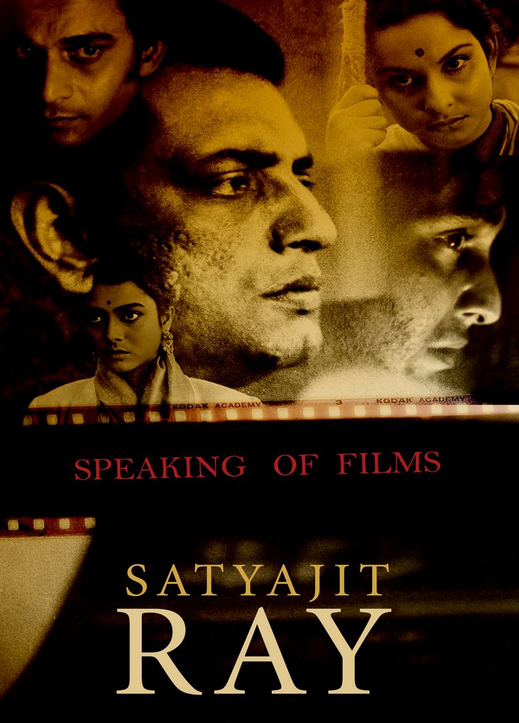
Ray


"Speaking of films" is the English translation of Satyajit Ray's "Bishoy Chalachitro" - a melange of articles regarding filmmaking. I read it in the original. Despite its slim appearance it still remains a definitive book for a beginner who wants to dabble on film-making. I just wanted to do a cover with intelligent dispersal of various eyes of the Ray's film protagonists looking at or away from each other.